A New You! (Tube)
YouTube is the 3rd most visited site on the Internet. It’s available in 61 languages and, with 72 hours of content uploaded every minute, it caters for hundreds of millions of users. Inevitably, designing your site to please every one of those people is an impossible task.
YouTube certainly gains a lot of commentary regarding its layout and design (perhaps second only to Facebook, who sometimes seem to have one of the most unhappy user bases of all time), and I’m sure we can all point out things that we’d like done differently. I made my own list, and I started to fix it.
Things I’d like to see in YouTube’s design
- Bigger videos: that’s why I’m there!
- Inline comments: I want to be able to browse comments whilst still watching the video (this has some very specific use cases)
- Less “gunf”: I rarely use “related videos”, or the navigation to the side
- Better usage of the screen: Full width on big displays, a responsive solution on smaller screens
I don’t work for YouTube so I couldn’t roll out “proper” changes but, as a web developer, I decided to make a Chrome extension that made this improvements for me. In basic terms, it allows me to run little scripts every time I open a YouTube video is loaded. It’s all done after the page had finished loading so, in case it breaks, everything just fall back to the standard YouTube display.
Incidentally, the extension broke the day after I wrote it when YouTube changed some of their code. So I can guarantee the fallback plan works!
Let’s take a look at how YouTube looks now:

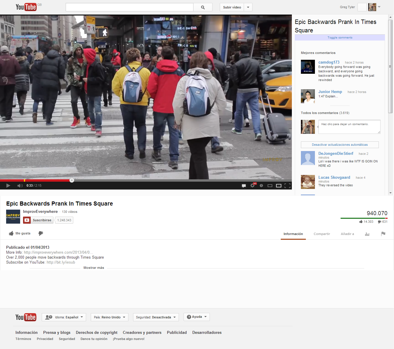
ImprovEverywhere’s Backwards Times Square prank on my new layout, complete with comments from people who don’t understand magic
As you can see, I’ve fixed some of my big issues. The page now centres around the video, which takes up most of the page. In fact, the fold of the page is just below the video (on widescreens like mine), so it takes up a solid two thirds of the visible page.
Comments are on the right and, since their container is the same size as the video, I can scroll through them whilst watching. You’ll notice too that some of the options surrounding the comments have disappeared. I took out the “reply” button and the up/down votes. Ultimately, YouTube’s comments have a lot of problems, and I thought I could start to alleviate some of them by making comments stand up on their own.
Smaller screens
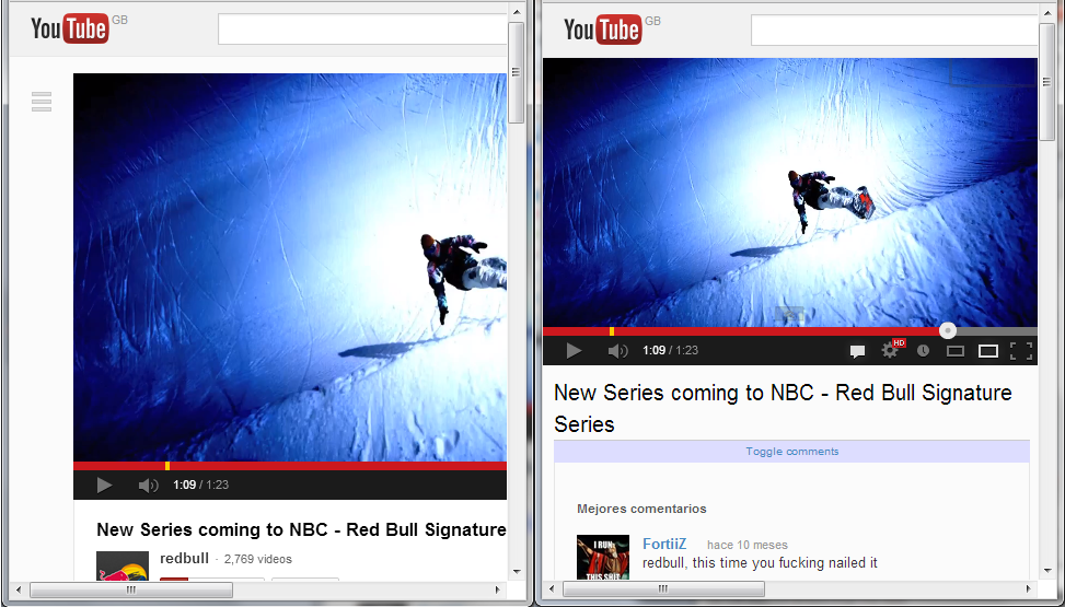
Perhaps more exciting is the responsive solution I have. I often watch videos in a small window on my screen whilst having something else open in another window (a word document, say). I wanted to make sure that YouTube would still be just as usable when I shrank the screen down, rather than overflowing from the window.

A before and after comparison of YouTube, shrunken to a smaller window.
On smaller windows, my redesign makes sure that the video fills exactly the width of the page. There’s no overflow, and there’s no wasted space around the sides. The comments appear below, again giving them pride of place. Below that, on all screen sizes, the video information appears, completely unchanged.
Results, and what’s left to do
I’m really happy with my new YouTube design. Some things that really bugged me have now been drastically improved. I know this isn’t a global “fix” and that other people would want other changes made, but it’s exciting to be able to move things around to my liking.
When I get some time, I’d like to play a bit more with the header and with the video information. They don’t really work responsively, which can be a slight pain. There’s also drastic changes I’d like to make to comments.
In a perfect world, I think comments should be “recommended for you”, so you can highlight comments from your friends and people you’ve voted up before. Downvoting comments should mean that all comments that user makes in the future will be rated down as well.
However, this requires more than a slight design change and I’d have to start saving up and down votes. Maybe when I’ve got a lot more free time…
What would you change about YouTube’s design?