Beyond buttons: Web interactions
I recently read an interesting article by Shane Mac about the failings of modern bots. It's a great article and well worth reading in full but to summarise, bots should accept a comment like "I want to book a table at La Granja at 7 tonight" and know to ask "how many people?", rather than the current prescriptive back-and-forth.
This got me thinking about web page interactions, and where we're falling short as web developers. I think there are several themes and topics to explore here, but I'd like to start by thinking about various types of interaction that are currently in place both in the web sphere, and with technology in general.
Clicking and pointing
The de facto standard for interacting with a web page is by clicking on things with your finger or mouse. Links were the original navigation experience of the web and were fundamental in shaping the network as it is today. More recently, buttons have allowed us to create rich form experiences where a user manipulates and submits data.
A benefit of clicking is that it opens a great many possibilities. On your first click on a laptop, there are millions of pixels available. Millions again on your second. Even on a phone, where clicking has become a physical and less-precise interaction, it's possible for developers to cram many options onto a screen.
However, clicking is not a very nuanced action. Right-click, long press and force touch all attempt to extend the abilities of pressing either a mouse button or a physical device. They all still have their limitations, and don't manage to quite replicate the depth of control wanted.
Keyboard interaction
Predating clicking, keyboards are the oldest form of computer interaction. However, they've recently fallen by the wayside as touch-screen devices don't have keyboard peripherals and typically have sub-par virtual alternatives. Certainly, performing a keyboard shortcut on a phone is a real challenge with no way to naturally bring up the keyboard, and no Alt or Ctrl keys.
However, keyboard navigation is still massive for some users. For example, it's a big accessibility element for those with poor vision or motor impairments because a mouse is difficult to work with. Web accessibility teaches us to make sites completely navigable with a keyboard for these users and many (myself included) often opt to use a keyboard for speed.
Keyboard shortcuts can be extremely powerful. For users familiar with your system, it can make repetitive tasks much faster, not requiring them to move a cursor across the screen multiple times. They're omnipresent, so they can be applied by the user from any location on the page. This cuts down on scrolling, both because they don't have to go and find a button, and because they can perform operations without losing their place in the page. No scrolling back and forth to preview changes.
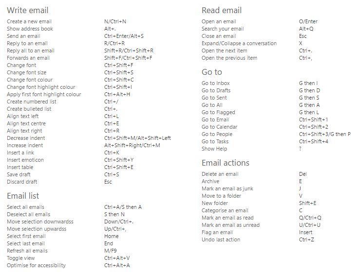
The big drawback to keyboard shortcuts is that they are absolutely not forthcoming. Whilst some commands are fairly ubiquitous (Ctrl+F will find something on the page, Ctrl+S will save what you're working on), communicating new or unusual commands is difficult. On the flip side, the ubiquitous commands can get in the way. If you want to create a shortcut for a "post" command, you'll find that Ctrl+P is taken and may be left with something that seems nonsensical.

A few of these main seem reasonable, but Outlook's shortcuts on Office 365 don't come naturally
Finally, keyboard shortcuts are hard to onboard new users with. Whilst Ctrl+S may seem second nature now, it's a difficult concept to explain to users. "What do you mean 'control'?" "Why that button?" "How will I remember that?" Try explaining that your site needs the user to press Ctrl+Shift+8 to create a new bookmark and I doubt they'll be thrilled.
Command interface
An extension to keyboard input is the command interface. These days mostly reserved to developers and computer engineers, the command line used to be the default tool of all computer users. Yet only a few years ago I regularly used one in the NHS to administer patient records, and I wouldn't be surprised to hear they're still doing so now.
Where command interfaces differ from traditional keyboard input is the ability they give to create more complex instructions. Rather than Ctrl+S, you can ask the computer to save assessments.txt --no-publish.
Whilst this is more powerful, it exacerbates the discoverability problems of traditional shortcuts. How do you know what arguments a command accepts? What additional options can you provide? Does order matter?
Web sites typically don't have a command interface (I've never seen one that isn't a novelty site), but I bring it up because in modern desktop browsers a command interface underlies all websites: the dev tools command line.
That command line has tremendous possibilities for extending website control, and they're almost consistently ignored. The most you're likely to see from websites today is a job advert suggesting that if you've managed to press F12, you could work for them.
Throughout development we use the command line to debug, and we sometimes (temporarily) expose functions to it to help test things. Like the cheat codes of old, it is a hidden language allowing us to access additional features by typing app.loadManyAnimals(). What I would like to see more of though, is leaving these cheat codes in place and inviting power users to access them. If a user wants to pull out their data, they could run app.data.toJSON() to retrieve it. If they want to quickly add a note without using the UI, app.insertNote('Buy milk', {reminder: '16:00'}).

You could expose functions publicly by design so that tech-savvy users could quickly access additional functionality
Command line interfaces aren't going to become mainstream any time soon, but I love the idea of opening up power-user features by giving them a bit more direct access. I think this would be a huge accessibility win too: I imagine keyboard-only users would rather press F12 and type a quick command than tab around hidden buttons just to send their email.
Voice
Voice interfaces have really come along recently. Last year, when Google announced their Pixel phone, perhaps its key selling points was the built-in assistant that would interact with your apps and you could talk to at any time. Apple have touted Siri's convenience for years. Meanwhile, the Amazon Echo and Google Home have only voice input.

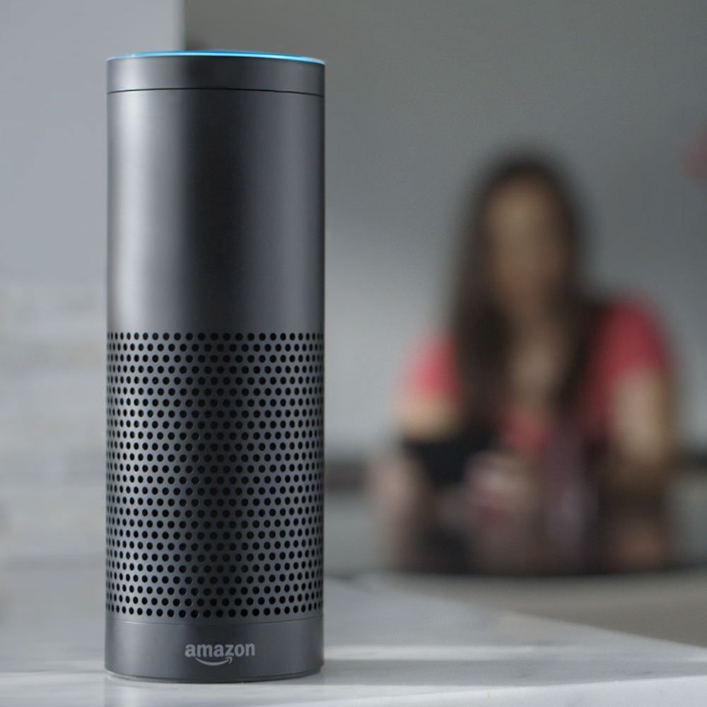
The Amazon Echo
There are two major benefits to voice interfaces, and they're clear in all the adverts: the convenience of the interface and how natural it feels. Talking with an Amazon Echo or Google Home device is like having a chat: "What's the weather today?" "How about tomorrow?" "And this weekend?" When a topic pops into your head you can just ask it there and then.
The downside to voice is that when it goes wrong, it's extremely frustrating. It can feel insulting, as if you weren't clear enough, or your accent is too thick. And it can be very hard to correct, particularly on these voice-only devices: there's no text box to type in what you really mean, or mouse to close the application that has opened.
Voice interfaces aren't easy to use in public. In part because it can be quite embarrassing (no-one wants to hear an office colleague try and fail to order pizza with their voice), and also because background noise can get in the way. I'm yet to see a parody of someone trying to use Siri at a gig to take a photo, but I'm sure it exists.
Finally, voice commands have a weird relationship with discoverability. There aren't really instructions on how to use Alexa and pals, or what questions to ask them. But that's because it should follow your natural expectations, and it's prepared to publicly admit defeat (whereas failed keyboard shortcuts just don't do anything). In this way, voice interfaces are quite fascinating: an average user may never find certain parts of a tool's vocabulary, or have any way to find them, but still feel quite complacent that they know it well.
Physical inputs
Lastly, I want to talk briefly about physical inputs. Physical inputs are, to my mind, those which connect the real world around you with the websites you are accessing. For example cameras, light sensitivity meters and accelerometers. I think physical controllers like those in VR fall into this category to, but I have so little experience with them that that's the only mention they'll get.
In the web, physical inputs are uncommon. Cameras and microphones are probably the most used, but that's typically for uses explicitly based around them: e.g. recordings and video calls. Beyond that, physical inputs are sometimes used in games in interesting ways, but I want us to explore their use in web applications.
The first usage of physical inputs that came to my mind was this: when typing a note or message you can shake your phone to quickly clear what you've written and start again. I think that would be a really helpful metaphor across multiple apps. Whether you're tweeting, emailing, writing a note, shaking would clear it.
The difficulty though, is how do we get to that common metaphor? Like a keyboard shortcut, we need to teach users it's there. But even more complexly, we need to get them to think differently about how they interact with their device.
I think this is an exciting area to explore. The idea of using physical actions and interactions to create a complex interface sounds quite exciting, and the promise of tools like Shazam and Google Goggles demonstrates the power of using these tools.
Conclusion
Clicking and pointing is still the de facto of user interfaces on the web, and I don't see that changing any time soon. But I'm really excited about the possibilities of enabling future interaction through the dev tools command line and physical input. I also can't wait to see how voice control makes it way to web interfaces.
In the future, I'll be writing about some practical applications of new interface methods and also looking further at the process flow and conversational interactions that Shane talks about in his article.