Working with Responsive Sites
Responsive web design has had an amazing year in 2012, and will surely continue to push across the internet in 2013. This year we've seen some huge sites get on board the Responsive train, including Mashable, The BBC and, heck, the most powerful man in the world, and I thought I'd write a post on my own personal comments of developing in a responsive environment.
BBC Mobile site 2010
What is Responsive web design?
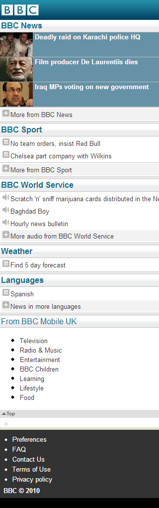
Our story with Responsive design starts on mobile phones. When our mobiles started gaining internet access, there was a growing demand for web developers to react and provide a version of their site that suited the small, handheld interface. Initially, this was achieved by creating a "mobile" version of the site. I particularly remember the BBC being a strong supporter of mobile sites, with specially-made versions of their homepage, news and sports sites.
Web apps got on the scene too, and the mobile versions of Facebook and Twitter are perfectly accessible on any device, and well worth a look.
It couldn't last…
The mobile sites worked well for a long while, but soon a new problem reared its head. As smart phones came into the market, screen sizes got bigger and mobile sites seemed somewhat lacking. Then tablets showed up with their "just slightly smaller than a laptop" screen size, and they just didn't have a natural home. Mobile sites looked ridiculous scaled up but any site designed to fit at 1000px (a fairly standard design size) would look squashed up on a tablet's, say, 768px screen.
Enter responsive web design! The main concept of RWD is that sites will work at any screen size (they "respond" to changes in resolution). This means that, rather than having a mobile version, a desktop version and a tablet version of your site, there is one golden design that is shown to all devices.
If this concept twists your mind, take a look at mediaqueri.es, a directory of great responsive designs. Alternatively, visit one of the sites in the first paragraph and try resizing your web browser to see what happens.
Designing responsively
A phrase often heard when talking about responsive design is "mobile first". Generally, this is the idea that rather than building a website for a desktop screen and scaling down, you should start with a mobile version and scale up. It's a nice idea, but I dispute its helpfulness when trying to create a full site. My approach is much more of "content first, on all screen sizes"; I believe that your content should lead your design and, rather than focusing on mobile, you should always be considering every possible resolution.
I'm sure this concept wouldn't fly for a lot of people, since it makes design development very much a bit-by-bit process, as each small element of the site is organised. I find it to work well though and particularly like that, since each part of the site is responsive in itself, I can cut and change elements a lot more casually.
Responsive Quizzard
When I started Quizzard, I was immediately aware that I wanted a responsive site. Here I'll take you through the example of a forum thread on Quizzard, and how my "content first, on all screen sizes" policy applied to it.

Above you can see a thread on Quizzard's forums (albeit a fake one) shown on both a desktop and a mobile device. Hopefully it's immediately obvious that the two screens show exactly the same content, they just present it slightly differently. This demonstrates the "content first" belief. My most important goal here was that every screen would show the posts, and who wrote them. I'll do another blog post in the future about how this fits in to my thoughts on forum design in general.
However, note how both the screens show the thread in different ways. On the desktop screen, I've used the extra width to throw a card to the side with the user's details on it. On the mobile screen, this information appears above the post and takes up noticeably less of the screen. This is the essence of designing responsively: Start with the content, work around it, and work on every screen size at once.